I designed these OTC product launch and promotion pages for Ro. The hero images feature products rendered in 3D using Blender, then comped into photos to create lifestyle product shots. Similar 3D and photo comps were created for the other images on the pages. The layouts were designed in Figma, then handed off to Ro’s developer partners for coding.
Role: Page design, photo editing, 3D renders

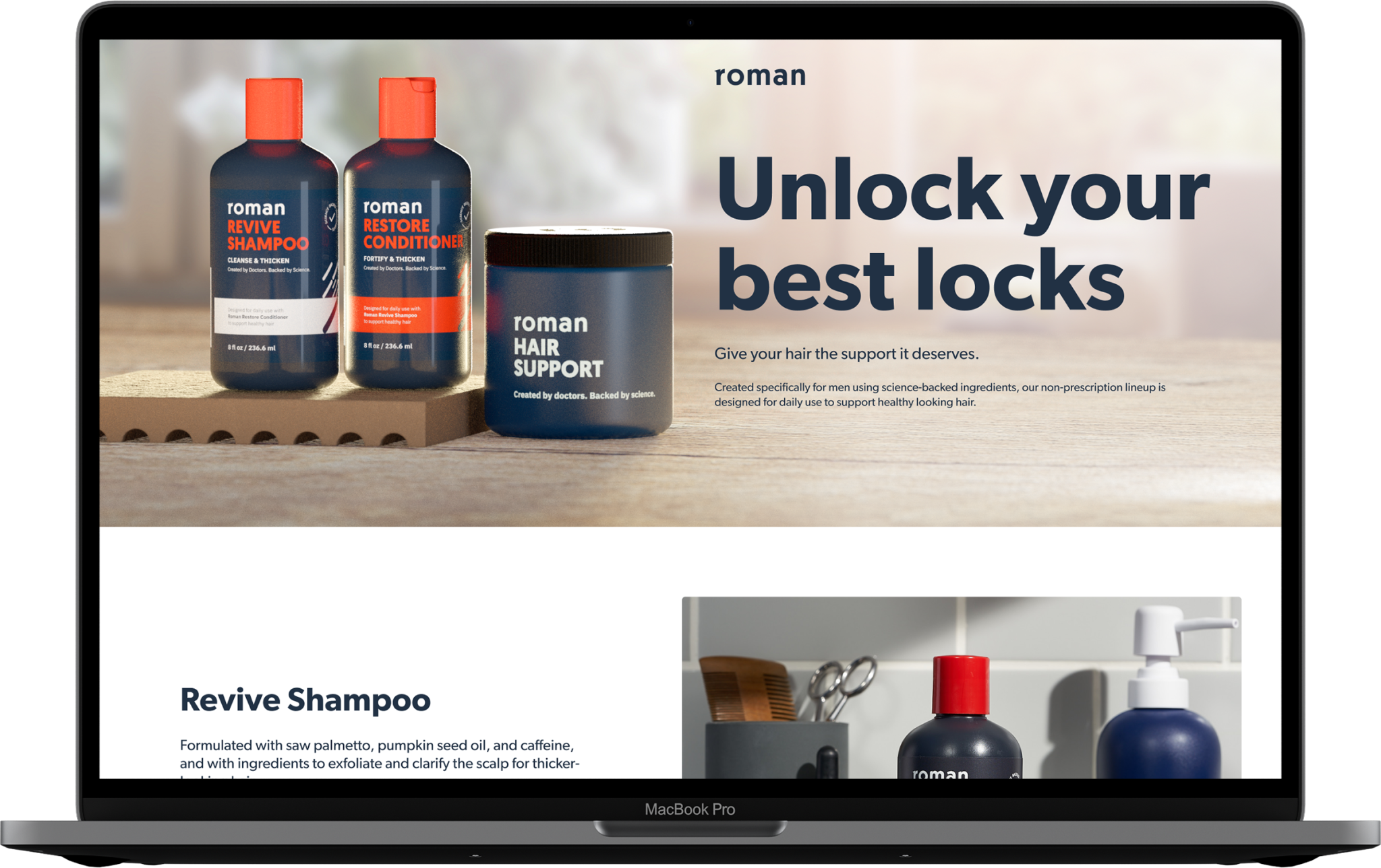
A product launch page for Roman shampoo, conditioner, and hair support supplements.
See the live page here.
The hero image is a comp of 3D Blender product renders backlit to match the sunny morning lighting in a stock photo.
The 3D renders had to match the actual photos used for each product feature. The last image of Hair Support Supplement is a hybrid photo / 3D comp.
An image from Roman’s fall lifestyle photoshoot appears through a parallax frame alongside value proposition copy.
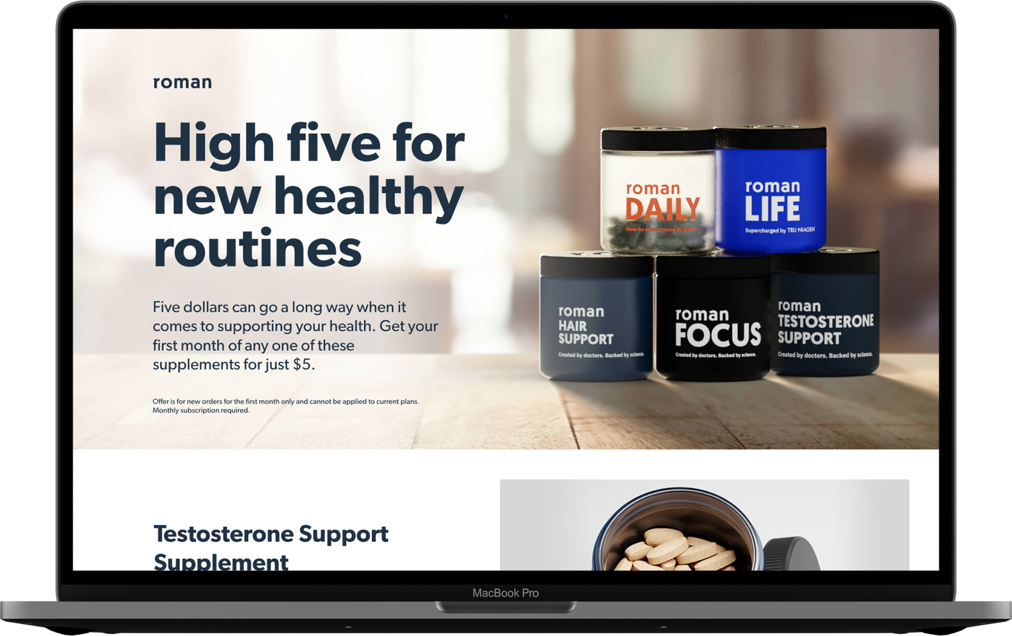
A promotion page featuring a collection of OTC men’s consumer healthcare products.
See the live page here.

The hero image is a 3D render of the five products, comped into a background image. Lighting and shadows were matched to achieve a realistic morning light effect.
The page features are a mix of 3D renders, with product and lifestyle photography, presented in breakout frames.